Squarespace_JMCo_Socialimage-07.jpg

Exify

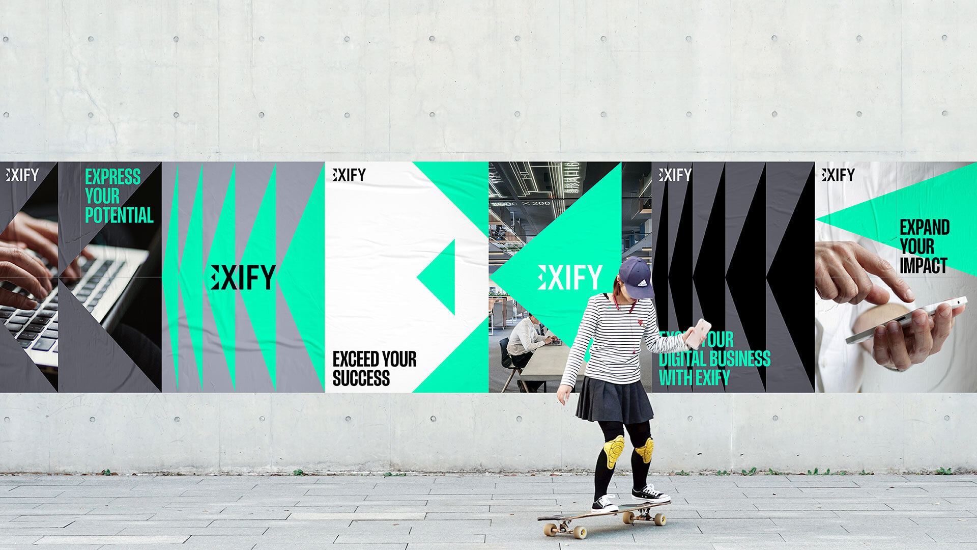
An identity based on amplification


EXIFY
VISUAL IDENTITY

An identity based on amplification

Exify build bespoke software solutions for businesses looking to become more efficient, go digital, or expand into the cloud.

The visual identity needed to position them as a modern and professional business providing digital solutions that have a direct business impact.


From the brief we focussed on a key insight; “we are a business which aims to amplify our clients’ goals”. The idea of amplifying their clients shaped our creative thinking and directed us to highlight the impact they have on their clients.

 
JonathanMartin_CaseStudy_Exify3.jpg

The graphic E monogram captures the idea of amplification. Each of the three triangles grow from left to right representing their impact on their clients' businesses. The three triangles also represent each of the three Exify business partners. The E monogram replaces the E in the Exify logo, making a simple and memorable set of brand assets.

 
JonathanMartin_CaseStudy_Exify6.jpg

A set of graphic triangles also convey this idea of amplification. The triangles grow from left to right to show this positive, driving progress and change.

The identities structure is formed by a fine, full-page, modular grid system. This creates the spaces required to frame the various identity elements and provides a sense of order and control.

 
JonathanMartin_CaseStudy_Exify8.jpg
JonathanMartin_CaseStudy_Exify9.jpg
JonathanMartin_CaseStudy_Exify10.jpg
 

RELATED PROJECTS

OSPREY CHARGING NETWORK

Inspired by bird flight

MODERN SPACES LONDON

Typographic tiles